 |
| About |
| Locations |
| Manual |
| Reference |
| Notices |
| HTML |
| Animation |
| Color Chart |
| Fonts |
| Frames |
| Heavy Graphics |
| Tables |
| Internet |
| Passwords |
| Processes |
| Results Lists |
| RidgeStar |
| Tools |
| Service |
| Logon |
Reference: HTML-Heavy Graphics |
|
| Get Started |Calendar |Locations |
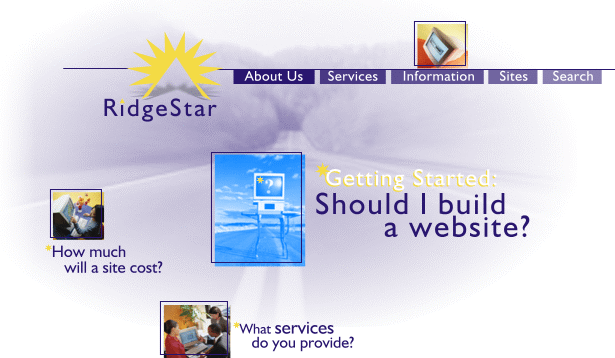
The following graphic is a sample of a "heavily graphical" RidgeStar homepage.

We do receive requests from time to time for this sort of an approach to a site. It's one large graphic with clickable areas (if you click on the buttons or links in the picture it will loop you back to this site at an appropriate location). There are benefits to this approach - the most important being that you have complete control over how everything looks and lays out. You can color and shade text while using any font you want. You can also use unlimited layering effects. If "image" is the most important thing you are selling then this graphic approach might be one option to consider.
The trade-off may be high though. Users have to wait for the graphic to load. How long did you wait for this page? They will also have to wait for the whole thing to download before they'll know what the page is about. Many users are more interested in finding the information they are looking for - more than seeing nice graphics. The other important issue to consider is search engines. They index pages by scanning the html text on the page (among other things). If the page is just one big graphic there won't be any text to scan. That could significantly lower your listing.
Before jumping into a situation with one large graphic, really consider your audience and what the goals for your site are.
| Copyright © 2025 by RidgeStar/webmaster@ridgestar.com |